Tally.so · Illustration
Illustrations that gave Tally.so its personality across very different channels — product launches, the website, merchandise and commercials — while keeping a single visual voice through all of them.
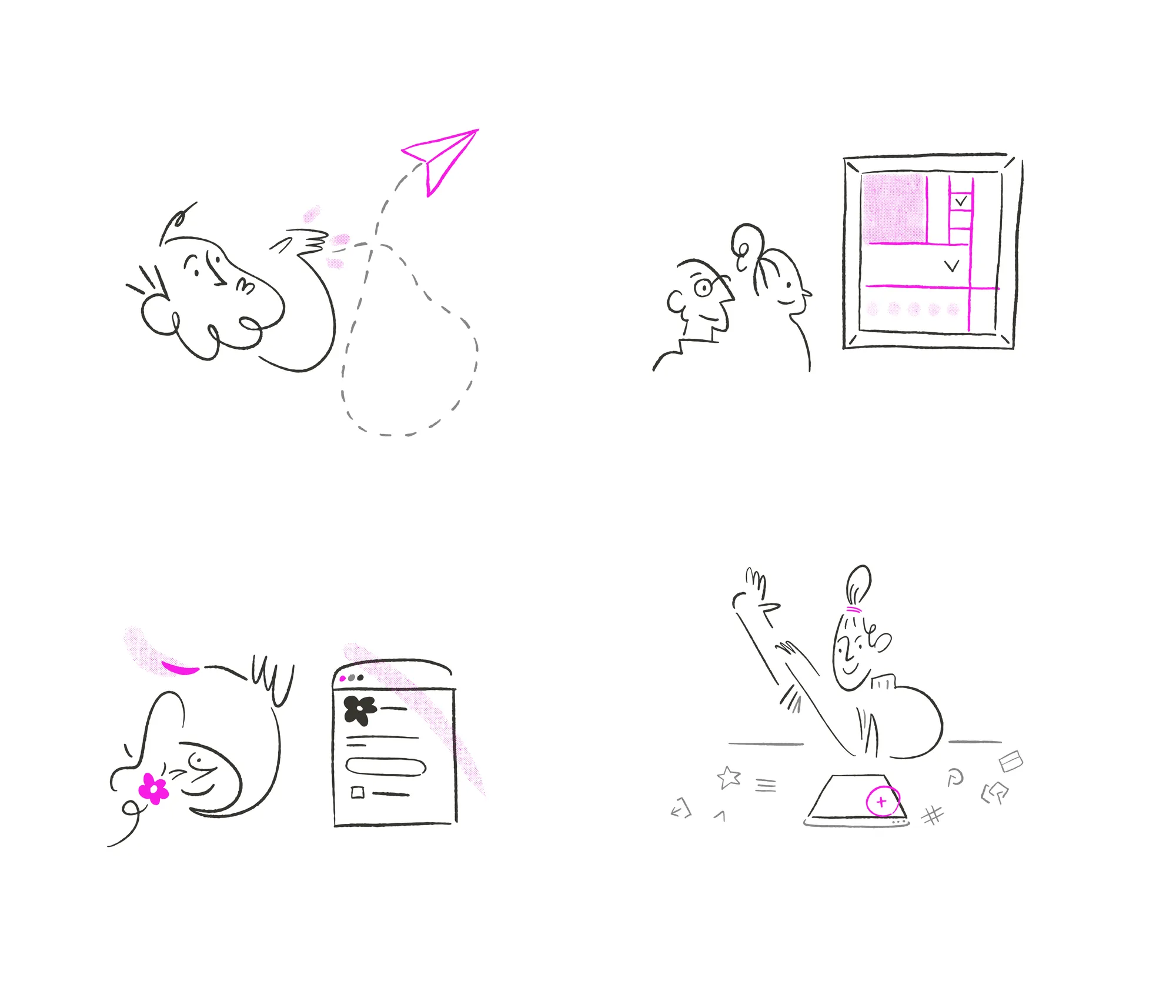
The context
Tally.so is a form builder that stands out on personality — a product that sounds human in a space that usually feels dry. Illustration is a big part of how that tone shows up. The challenge isn't making one nice drawing; it's making the same personality survive across contexts that have almost nothing in common.
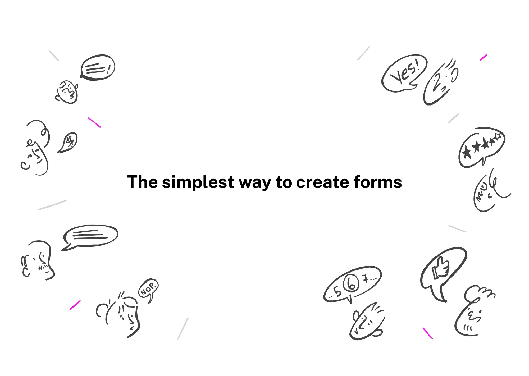
The work, channel by channel
I illustrated across four fronts, each with a different rule. Launches: pieces that give a new feature a face and have to read instantly, in-feed, against everything else. Website: illustration that accompanies and explains, with more attention to spend. Merch: the drawing becomes a physical object — print, material and scale change everything. Commercials: the same language in motion, where timing and rhythm enter the equation.
The idea holding it together
What makes it work isn't any single piece, it's the coherence between them. I kept one hand — same line, same cast of characters, same humour — and let each channel dictate density and format, not style. So someone who sees a commercial, gets a launch email, then picks up a t-shirt recognises the same brand without having to think about it. Consistency is the product; the pieces are just where it shows up.
TL;DR
Illustrations that gave Tally.so its personality across launches, website, merch and commercials. Each channel imposes different rules (fast feed, website reading, physical object, motion), but I kept one hand — same line, characters and humour — so it all reads as the same brand. The coherence between the pieces is the work.
※