Itaú Saúde
Redesigning the health-insurance portal and app for the employees of Brazil's largest bank — for the users most of the industry quietly designs around.
The real problem
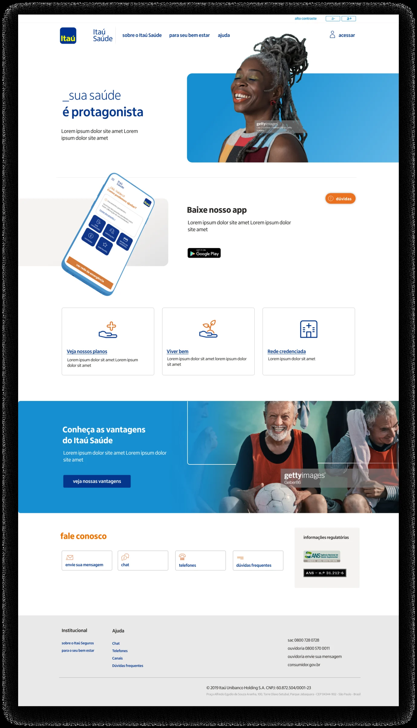
Itaú Saúde is the health insurance Itaú offers its own employees and retirees. The product existed, but it had been built and run by an outside insurer, Porto Seguro. So the people logging in worked at one of the most recognizable digital brands in Brazil, then landed on something that looked and behaved like it belonged to a different company entirely.
That mismatch was the brief on paper. The harder problem only surfaced once we looked at who was actually using it: a large share of the audience was elderly — long-tenured employees and retirees. This wasn't an edge case to accommodate at the end. It was the center of gravity of the whole project. Most insurance interfaces are built for a confident, fast, mobile-first user. Ours had to work for someone who reads slowly, distrusts unfamiliar patterns, and gives up the moment something feels uncertain.
So the question stopped being “how do we make this look like Itaú?” and became “how do we make a financial product genuinely usable by the people the category usually ignores?”
My role
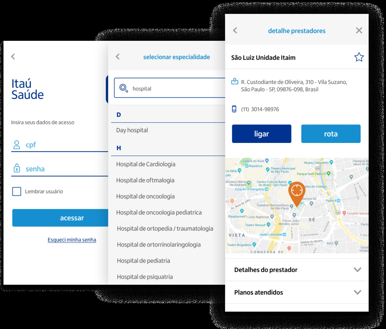
This was done inside Ana Couto Design. I led the information architecture and wireframes, and designed the UI of the core pages — the templates the UI team then extended across the rest of the product — plus several key app screens. In practice I owned the structural and interaction decisions that everything downstream was built on top of.
The decision that shaped everything
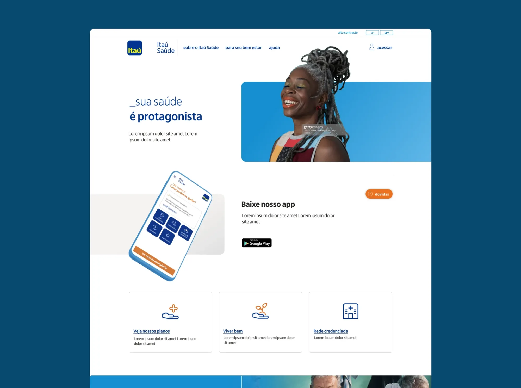
Designing for an elderly user forces a position on a question most teams never have to answer out loud: do you follow current visual trends, or do you follow what the user already knows? We chose the user's existing mental model, deliberately, even when it cost us aesthetically.
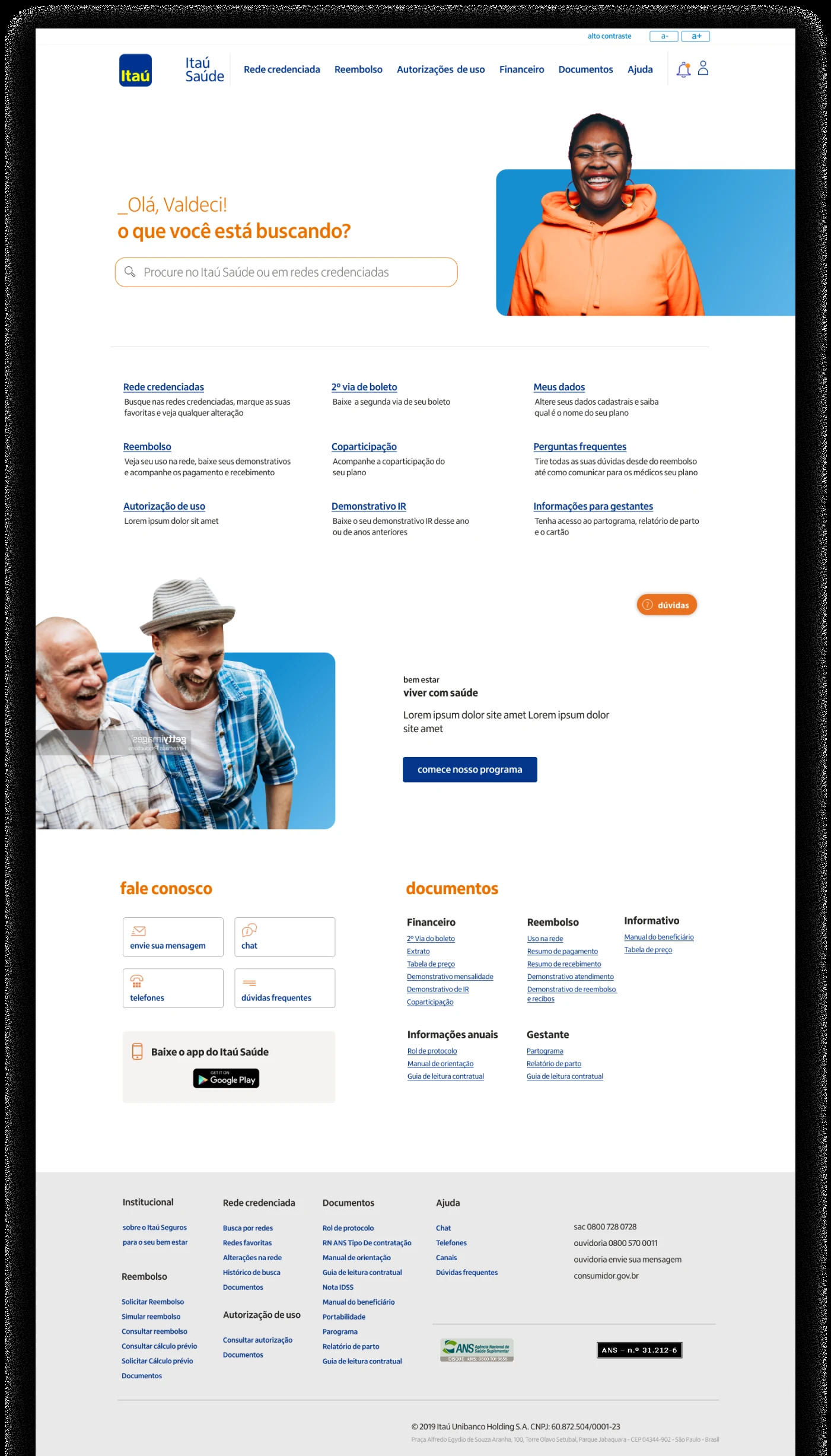
The clearest example: we made primary actions look like underlined hyperlinks rather than the filled, rounded buttons the rest of the industry was converging on. A modern button is “cleaner,” but to someone who learned the web in its early-2000s form, an underlined link is unmistakably a thing you click. We traded contemporary polish for instant recognition — and for this audience, recognition won every time.
Typography followed the same logic. Type size and contrast weren't styling choices made at the end; they were load-bearing decisions made first, grounded in established accessibility research on older users. The layout was designed around large, high-contrast type as a constraint, not decorated with it afterward.
The reference that gave us permission
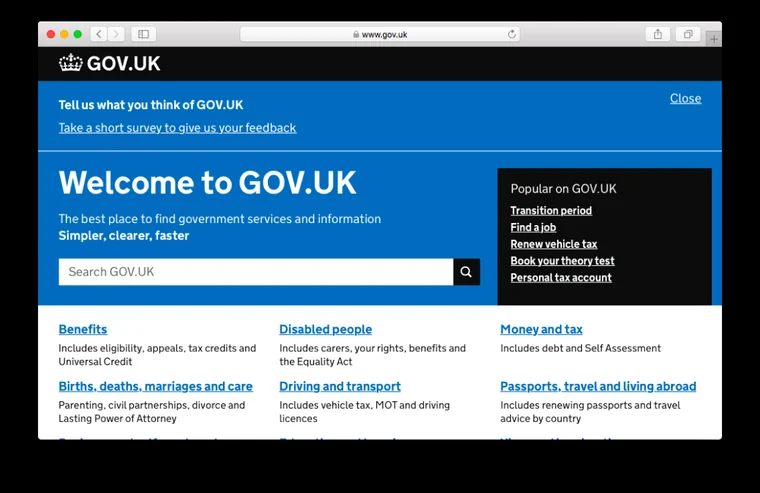
The benchmark wasn't other insurers — their products had the same problems we were trying to escape. The reference that mattered was gov.uk.
Gov.uk is built on an uncomfortable but liberating premise: a government service has to work for everyone, including the least confident, least technical user, so it strips away anything that isn't doing a job. That gave us the argument we needed internally. “Plainer” stopped being a compromise and became the point. It let me defend restraint — fewer styles, bigger type, obvious links — as a feature rather than a lack of ambition.
How I solved navigation
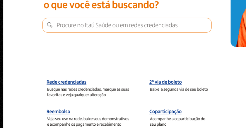
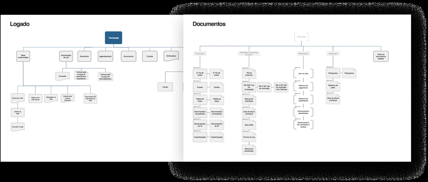
The architecture problem was that elderly users don't navigate one “correct” way — some scan, some read menus, some search, some just need the one document they came for. Designing a single happy path would have failed most of them.
So I built multiple redundant routes to the same destinations. The homepage surfaces the highest-value actions as quick links up front. Smaller links lead to secondary features and to the documents people actually log in to find. And the same things are reachable through the menu and through search. Nothing depends on the user “knowing how” to get somewhere — whichever instinct they follow, it works.
Honest note
I owned the structure and the core interface patterns, then handed the system to the UI team to extend. The decisions I'm proudest of here are the unglamorous ones — the hyperlink-styled actions, the type scale, the redundant navigation — because they came from taking the actual user seriously rather than from chasing a trend. The risk in a project like this is that “accessible” becomes an excuse for “unconsidered.” The work was making restraint feel intentional, not cheap.
TL;DR
Itaú hired us to redesign the portal and app for the health plan it offers its own employees. The audience skewed heavily elderly, so I anchored the information architecture and core UI on legibility, high contrast, and familiar patterns — including primary actions styled as plain hyperlinks — using gov.uk as the model for principled restraint. The goal was a financial product that works for the users the category usually designs around.
※