Nurent
A São Paulo car-rental startup. I was brought in to design the interface and the brand — and the contribution that lasts is the visual system and the components that oriented the whole app interface.
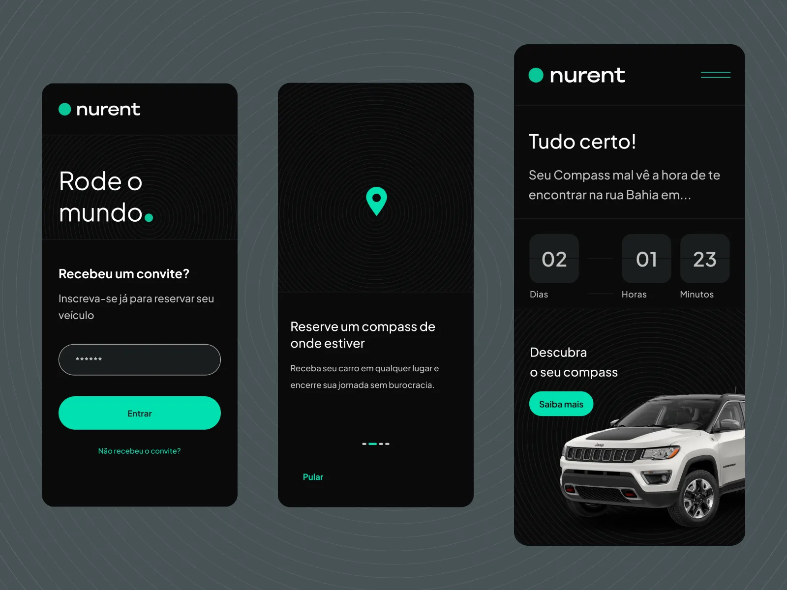
The context
Nurent is a car-rental startup out of São Paulo. I came in to design two things at once: the app interfaces and the brand identity. Startup at startup pace — tight timeline, moving scope, decisions being made in parallel by different people.
The complication — and how I frame it
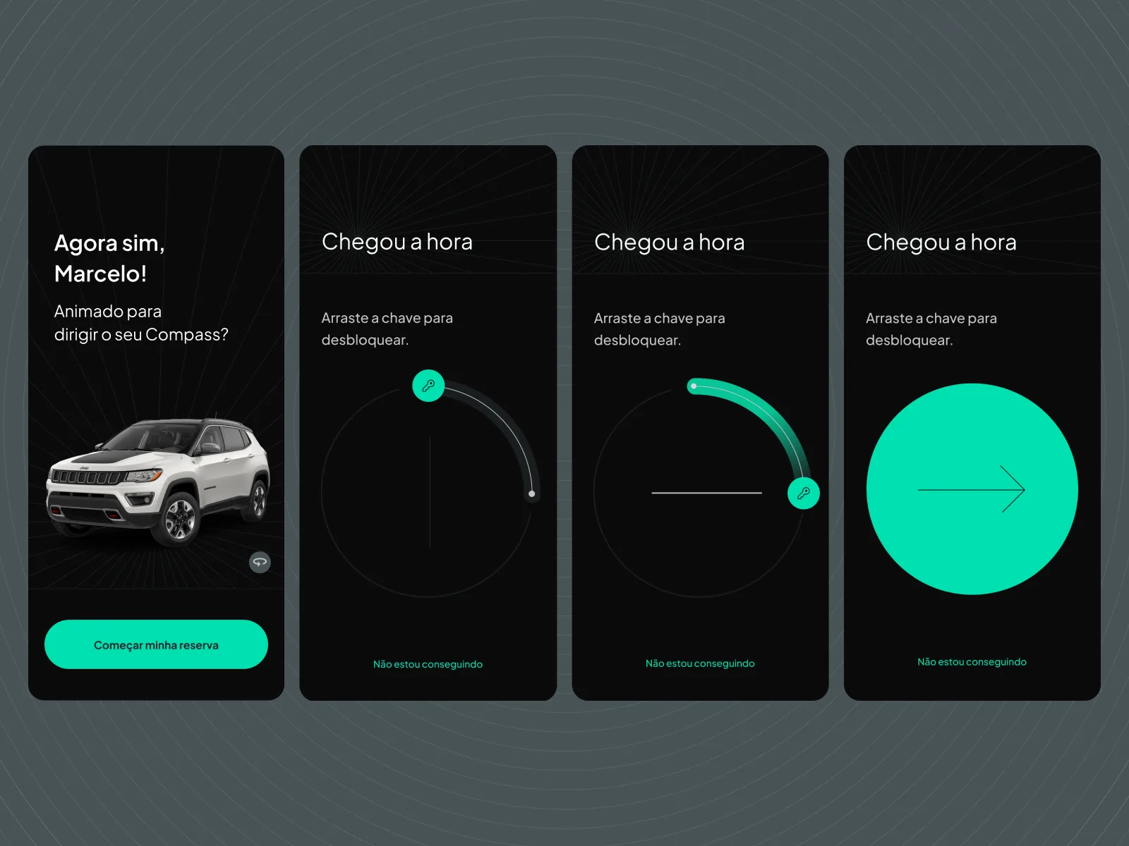
The brand ended up being redone by another designer: logo and colour palette changed. And because the app's central interaction was tied to the brand, it shifted too when the logo changed. That's normal in a startup, and I don't treat it as anyone's fault. I treat it as the fact that honestly marks where my contribution ends.
So I won't claim the final brand or the central interaction as mine. What I do claim is what I actually built — the part that held the product together.
What I actually built
I designed the visual system: the tokens, the components and the visual patterns that the entire app interface rested on. It isn't the glamorous layer — it's the foundation. The UI looks good because the system beneath it was built right: consistent spacing, hierarchy, states and component behaviour from screen to screen.
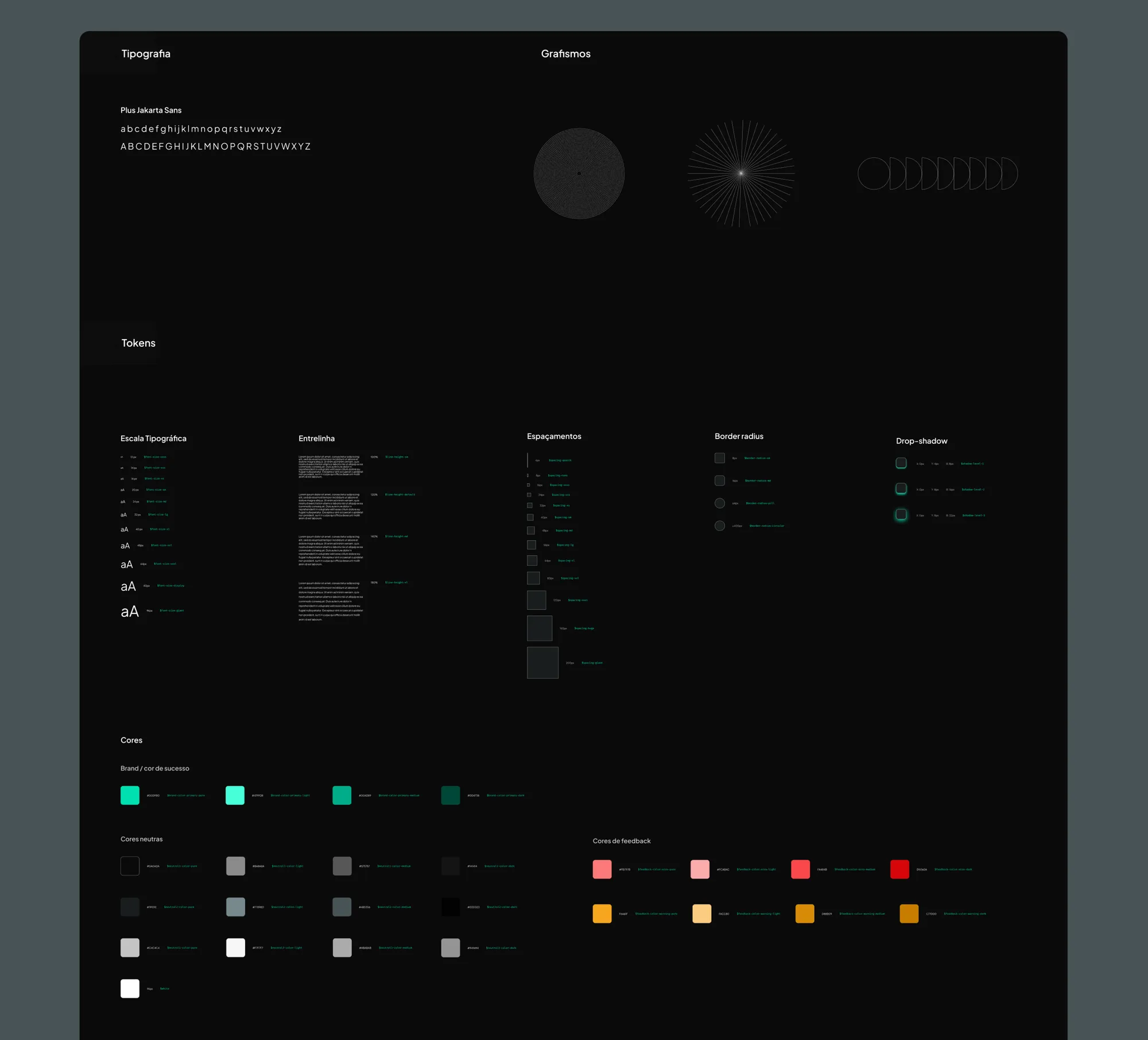
A concrete example
The clearest example is search. I designed a search with shortcuts and filters in the spirit of a spotlight — the user summons it, types, filters and lands directly on the car they want, instead of descending through menu levels. It's a small component carrying a big opinion: in a rental product, the speed of finding is the experience. That pattern lives inside the system, so any screen could inherit it.
Why the foundation is the point
It's tempting to show the prettiest screens and call them mine. But the real value — the part that survives a technical interview — is the groundwork: deciding the tokens, drawing the components, setting the patterns that make the rest of the interface feel inevitable. That's what I made — the visual system and the components that oriented Nurent's interface.
TL;DR
I joined Nurent, a São Paulo car-rental startup, to do interface and brand. The brand was later redone by another designer and the central interaction shifted with it — so I don't claim that. What I built, and what held the app together, was the visual system: tokens, components and patterns, with a spotlight-style search (shortcuts + filters) as the concrete example of the opinion behind the system.
※