Grupo Salta · Design System
An education group of around 20 brands, each on Bootstrap with no cohesion. I brought one clear position to the table: design the system as a working tool, not merely as a visual simplification.
The real problem
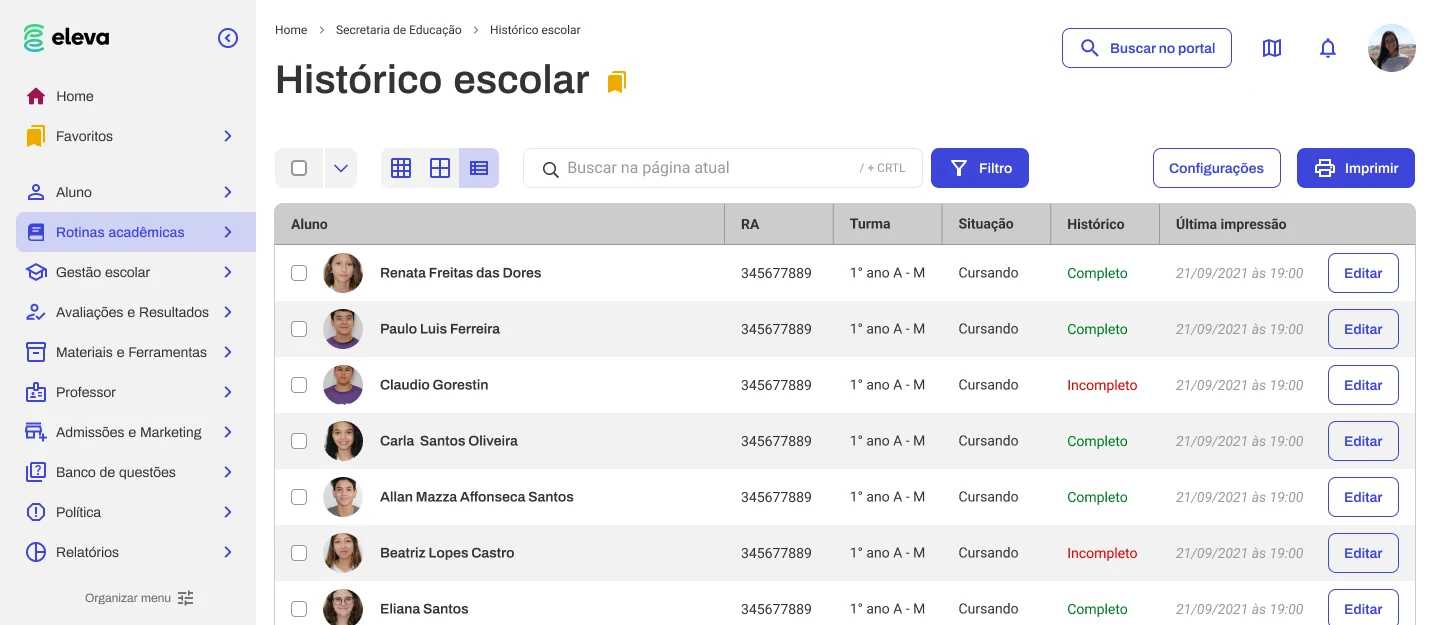
Grupo Salta brings together around 20 education brands. Each school lived on its own Bootstrap build, with no cohesion between them: inconsistent patterns, fragmented visual systems, no shared foundation. It wasn't ugly by accident — it was the result of twenty teams solving the same problems separately, twenty times over.
My position
A design system can be treated as a clean-up — pull everything together, make it consistent, done. I argued for something else: designing the system as a working tool. The test shouldn't only be “is it prettier and more uniform?” but “does this make the people using it faster? does it lower cognitive load? does it speed up the everyday tasks?” Consistency is a by-product; efficiency is the goal.
The process, and what was collective
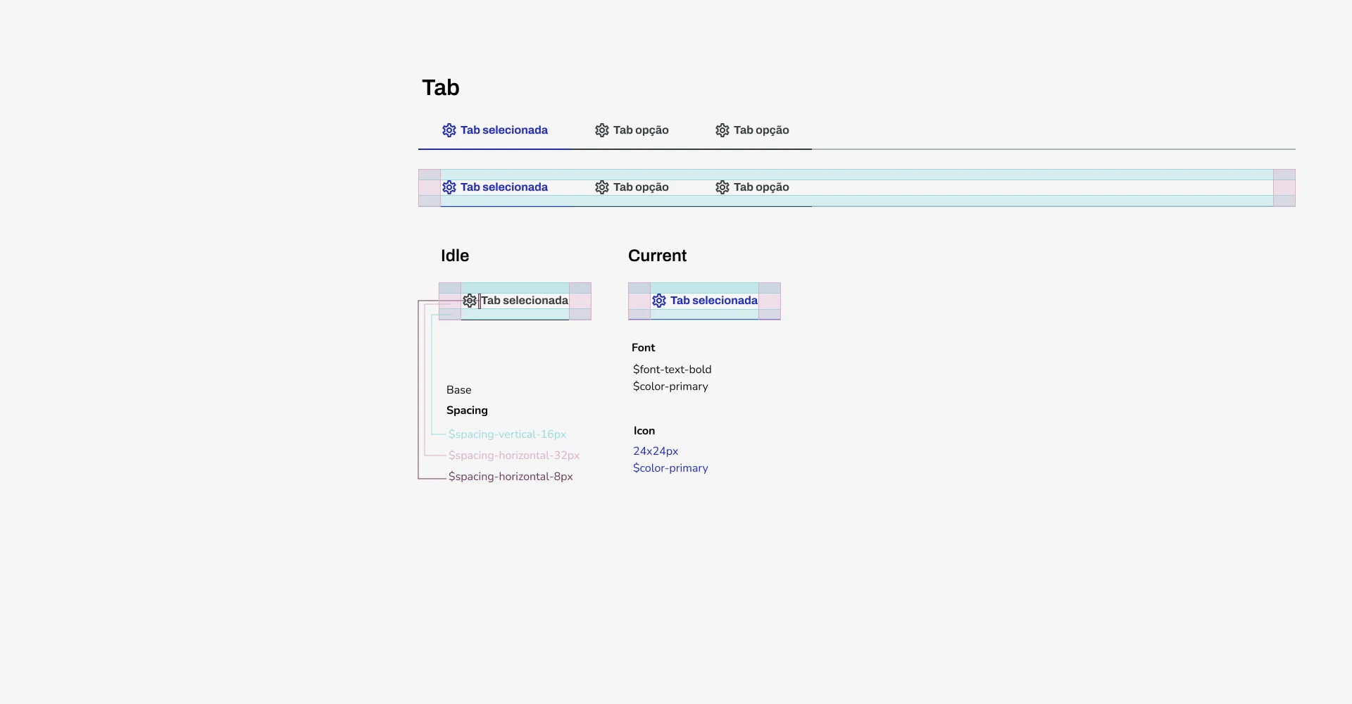
The work was done as a team: a collective audit and curation of the elements that already existed, with direction decided together. I'm honest about that because it's what makes the case survive a harder conversation — several core decisions were collective, and I held clear positions inside them rather than owning them alone.
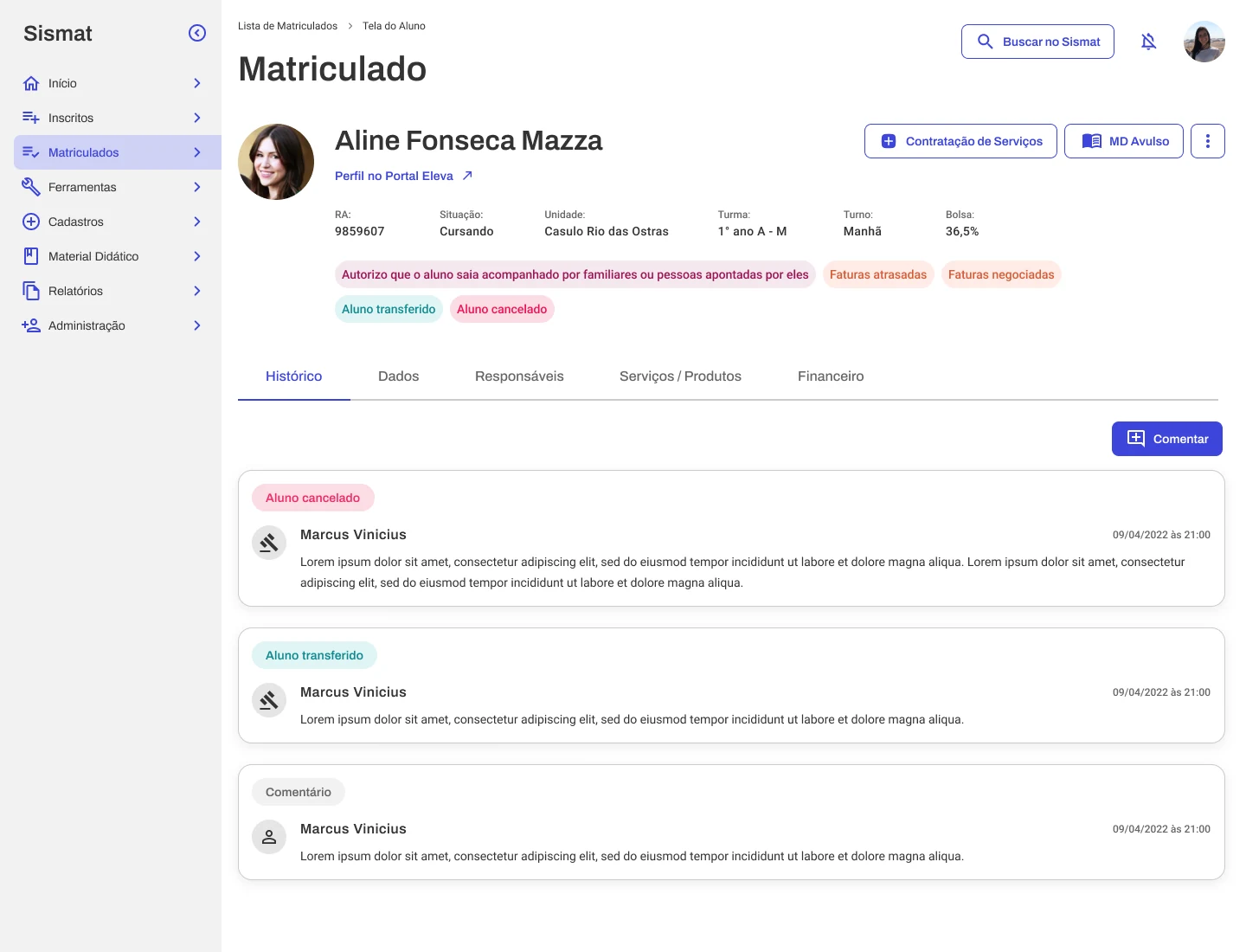
Among the collective decisions I took a position on: the menu patterns; the global search; and a deliberate white palette, so each school could layer its own theme on top without fighting the system. That last one — white as the base for per-school theming — is, to me, the project's strongest curatorial signal: it resolves the tension between one system and twenty identities without picking a side.
What made it into v1
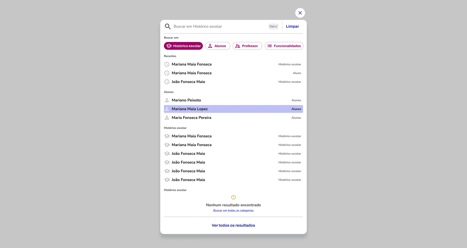
Being honest: not all of my vision reached v1. But specific components clearly carry that working-tool approach. The sharpest example is the search with shortcuts and filters, designed to accelerate staff workflows — find fast instead of navigate. It isn't there for decoration; it's there because it embodies the thesis that the system exists to make work faster.
Why it mattered
A fragmented system is expensive in an invisible way: every team re-pays for the same work, and the user pays in cognitive load. Bringing a working-tool mindset changes what the system measures success by. Even with part of the vision deferred, the components that shipped signal the direction — and it's that curatorial direction I sign, without inflating what was collective.
TL;DR
Grupo Salta: ~20 education brands, each on Bootstrap, no cohesion. Inside a team process (collective audit and curation), I argued for designing the system as a working tool — efficiency and lower cognitive load, not just uniformity. Collective decisions I took positions on: menu patterns, global search, and a white palette for per-school theming. Not all of the vision reached v1, but components like the shortcut-and-filter search carry the approach.
※