Ambev · Connect
Ambev runs on suppliers across 14 countries — and on the 15 systems they juggle to work with it. The brief looked like “merge them into one.” The real job was deciding what could actually be merged, and designing honestly for what couldn't.
The real problem
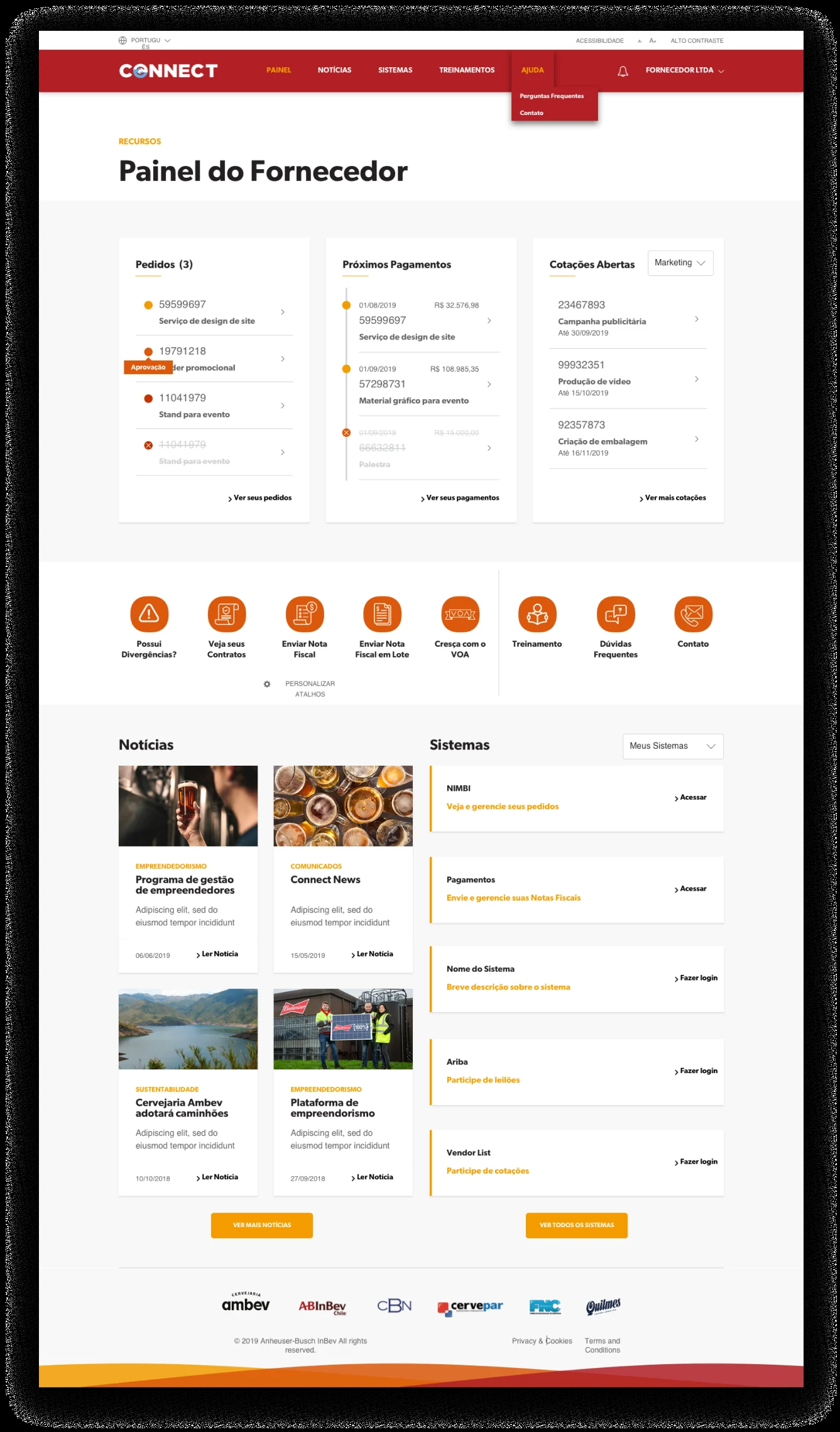
Ambev is the largest brewer in the world, operating across 14 countries in the Americas. An operation that size doesn't run on beer; it runs on suppliers — transport, packaging, outsourcing, ingredients — and on the software those suppliers use to work with it. Over the years that had sprawled into 15 separate systems. Connect was Ambev's attempt to pull all of them into one place, and we were brought in to make Connect actually work.
The brief, on paper, was “consolidate the 15 systems.” The more I looked, the clearer it became that the brief was a trap. Some systems could be pulled together. Others were owned, regulated, or country-specific in ways no redesign could dissolve. The real problem was never “merge 15 systems into one.” It was “integrate by API what can genuinely be integrated — and design honestly for the complexity that's going to remain.” Flattening all of it would have shipped a lie with a nice UI on top.
My role
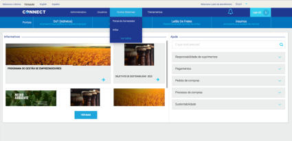
This was done at Ana Couto Design, under Astrid Tempter, head of UX. I ran the discovery: I wrote and ran the interviews, designed the survey forms, analyzed the results, and turned them into the diagnosis of what was actually wrong with Connect — then the personas and the wireframes the solution was built on. Later I designed UI for several pages and did visual QA alongside the front-end team.
The decision that shaped everything
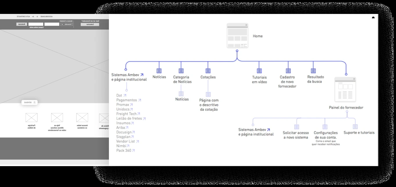
The pivot was accepting that not all 15 systems could become one. With Ambev's development team, we audited which systems could push their data into Connect through an API and which couldn't. That technical line — integrable vs. not — became the design's organizing principle. Instead of one fake “unified” screen, I designed a modular dashboard that assembles itself from the blocks a given user can actually reach.
Choices as trade-offs
We traded the illusion of a single system for an honest, composable one. A supplier in one country, with one set of permissions, sees a different Connect than a supplier in another — because the dashboard recomposes around two axes: what systems the user has permission to use, and which country they're in. I traded a fixed layout for a modular one that could keep absorbing systems as more of them became API-ready, and traded “looks unified” for “is actually usable.”
How I solved it
The approach earned its confidence from the research, not from taste. I interviewed 10 suppliers across South America, then sent survey forms to suppliers in 6 countries — half of Ambev's supplier base — to pressure-test a first diagnosis, and then to the other half to validate it. The diagnosis kept surfacing problems that lived outside Connect itself, in the surrounding systems and processes. That's exactly what justified the API audit and the modular dashboard, rather than another coat of paint on the old portal.
What I shipped
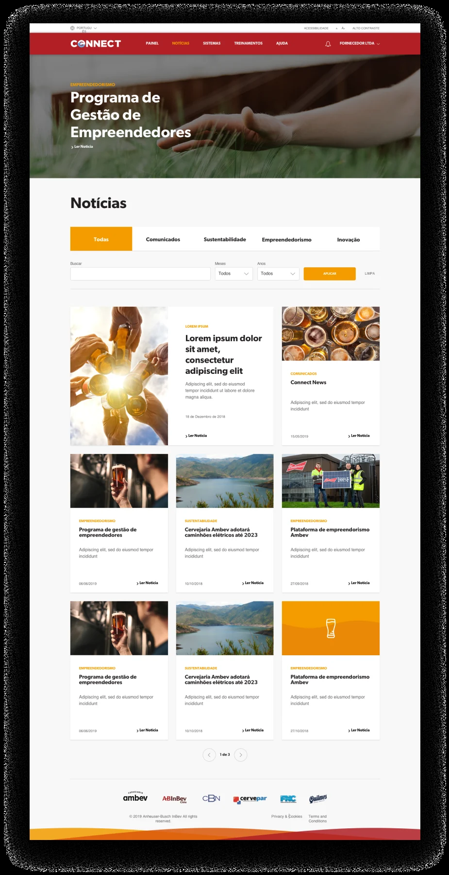
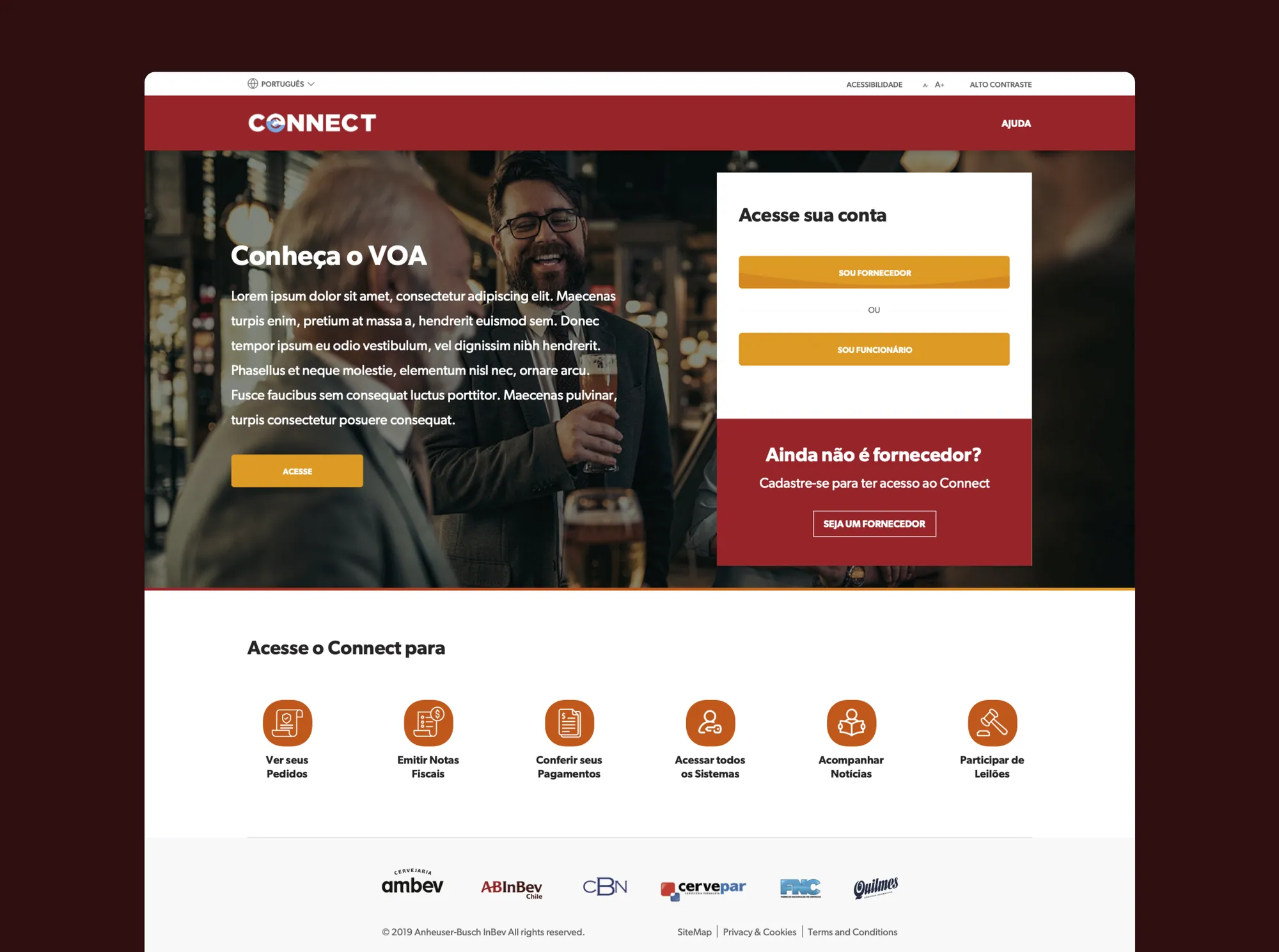
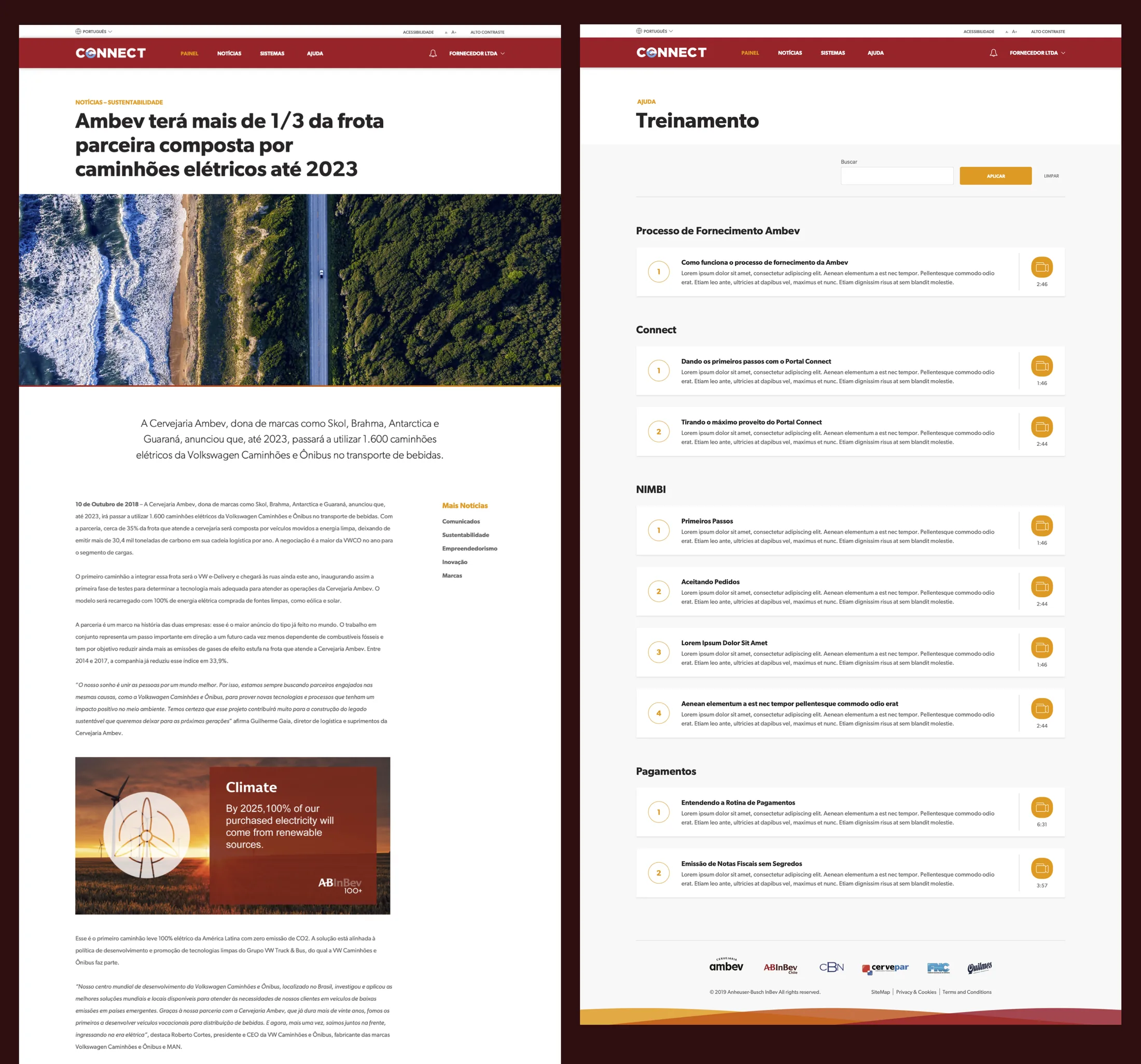
With the wireframes validated against Ambev, we produced the interfaces and front-end: the institutional site, registration, onboarding, the supplier dashboard, and even Connect's administration. The system extended well past a single home screen.
Honest note
My center of gravity was research → diagnosis → structure; the UI was a shared effort with AC's UI team, and the API boundary was drawn with Ambev's developers, not by me alone. The part I'd defend hardest isn't a screen — it's the decision to stop chasing a single unified system and design for integration-plus-honesty instead. The failure mode here is a dashboard that looks consolidated while the supplier still juggles logins behind it. Naming what's integrated and what isn't was the point.
TL;DR
Ambev, the world's largest brewer, wanted its 15 supplier systems consolidated into one platform, Connect. They couldn't all be merged — so, with Ambev's developers, I helped draw the line between what could be integrated by API and what couldn't, and designed a modular dashboard that recomposes around each user's permissions and country. Grounded in interviews across South America and surveys in 6 countries. The win wasn't a unified system; it was an honest one.
※