BBC Maestro · Illustration
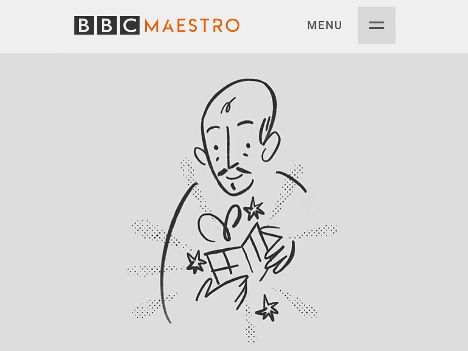
Illustrations for BBC Maestro's website and email newsletter — giving human warmth and a made-by-hand feel to a product that sells on trust in the people who teach.
The context
BBC Maestro sells online courses led by well-known names — people whose face and reputation are the product. That puts illustration in a specific place: it can't compete with the instructors, and it can't become generic decoration. It has to give warmth, rhythm and personality to the spaces between the photography.
The work
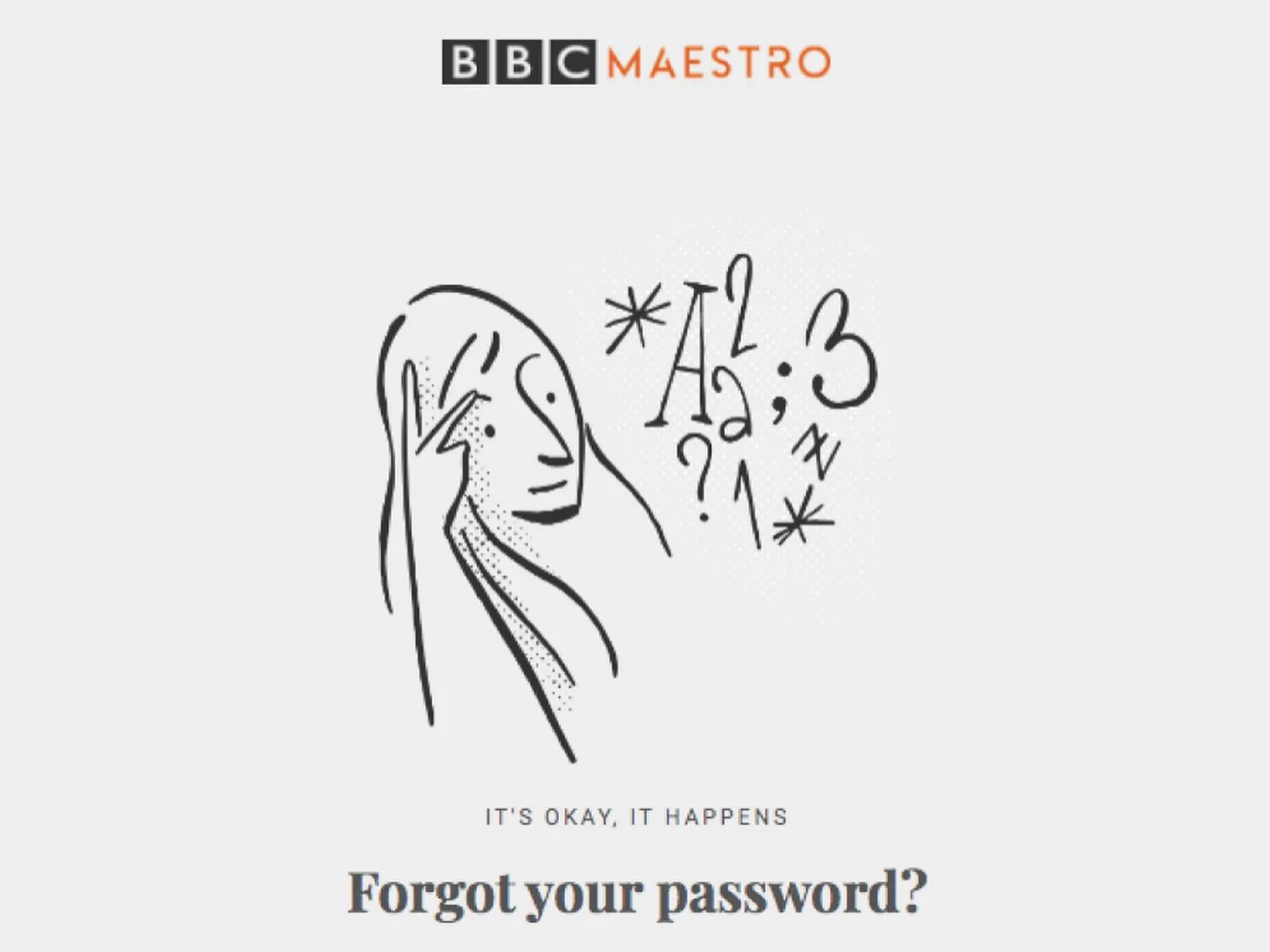
I made illustrations for two surfaces with different demands. On the website, they accompany and guide — supporting reading, marking sections, carrying moments that photography doesn't cover. In the newsletter, the job changes: email is a hostile environment (narrow widths, unpredictable rendering, most people reading on a phone in seconds), so the illustration has to communicate quickly and survive at small size.
The idea holding it together
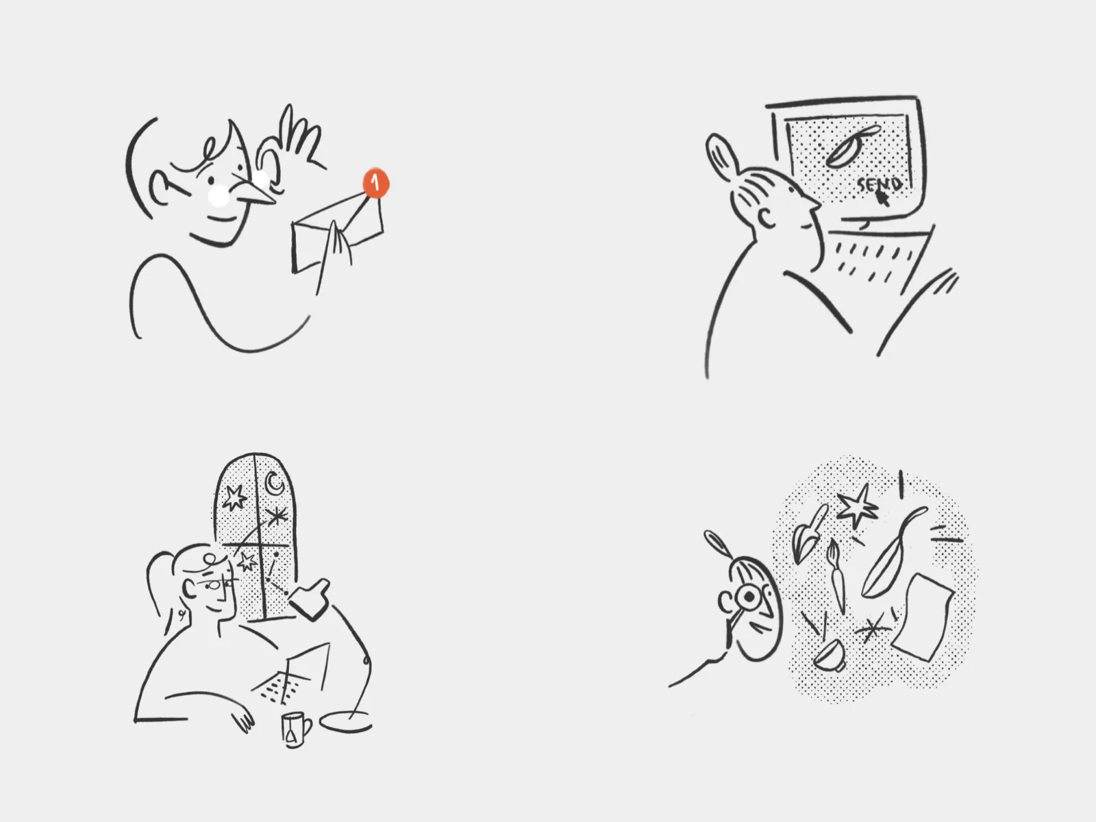
The same hand has to make the website and the email read as one thing. So I treated the set as a system, not as loose pieces: consistent line, palette and level of detail, tuned to each surface's density. On the site, more room and detail; in the newsletter, the same language squeezed to the essential. That's what makes the illustration feel like part of the brand rather than something pasted on top.
TL;DR
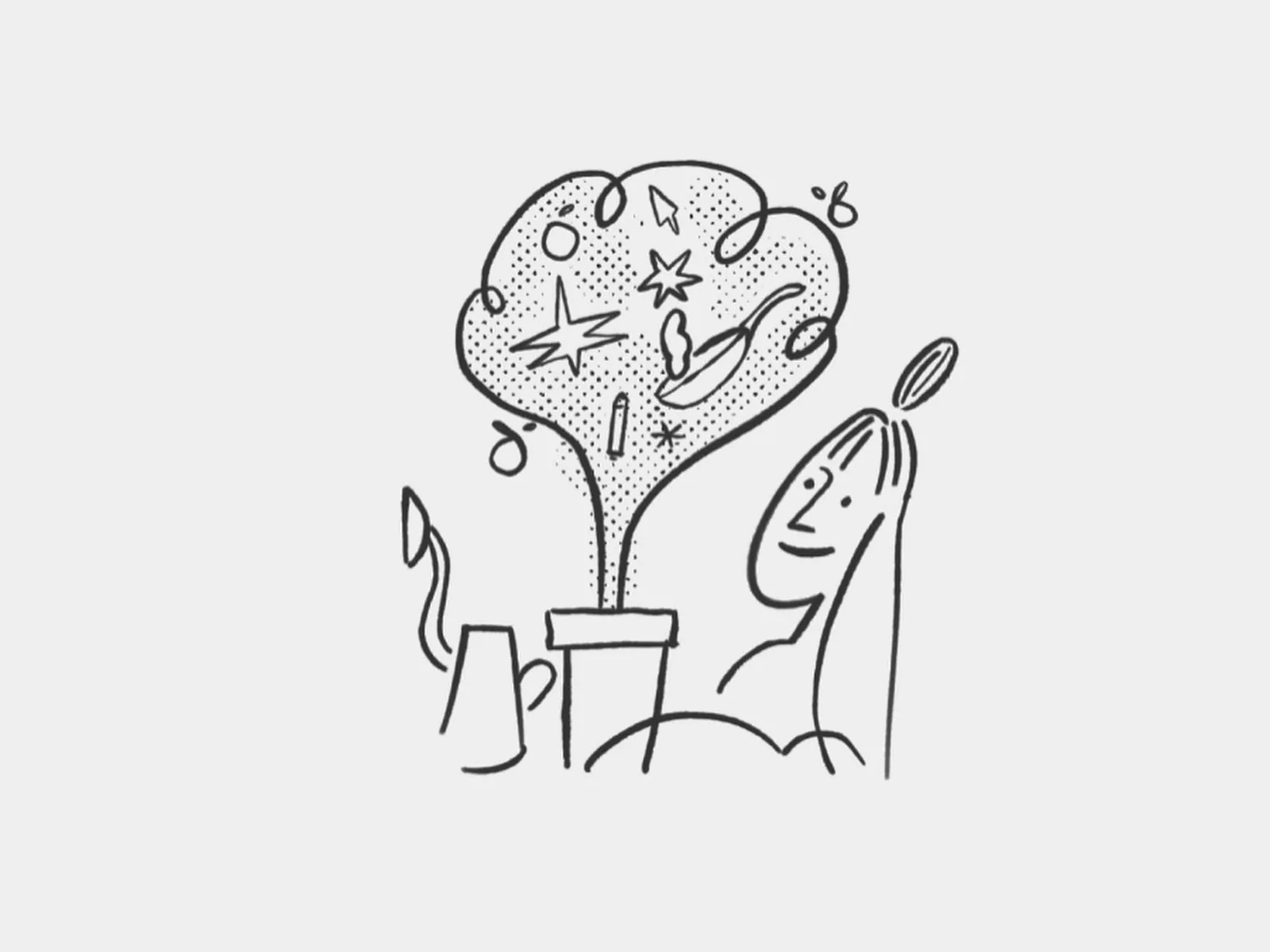
Illustrations for BBC Maestro's website and newsletter. Because the product sells on trust in its instructors, the illustration gives warmth and personality without competing with them — and works as one system: the same hand on the website (more detail) and in email (squeezed to the essential and legible at small size).
※