Celso Lisboa · Liga
Designing the whole learning-and-evaluation experience for a college that moved online in a matter of weeks — without letting a brutal deadline make the evaluation logic sloppy.
The real problem
Celso Lisboa is a college in Rio de Janeiro. When the pandemic closed the campus, processes that had always been physical — attending, submitting, sitting an exam, being graded — had to exist digitally, and fast. This wasn't a calm “digital transformation” roadmap. It was keeping a college running while the ground moved under it.
The deadline was the obvious enemy. The real enemy was subtler: under pressure, the temptation is to simplify the one thing you can't simplify — evaluation. A bad assessment flow isn't just an ugly screen. It's a wrong grade on a student's record.
So the question stopped being “how do we ship fast?” and became “what has to be right even when everything around it is rushed?”
My role
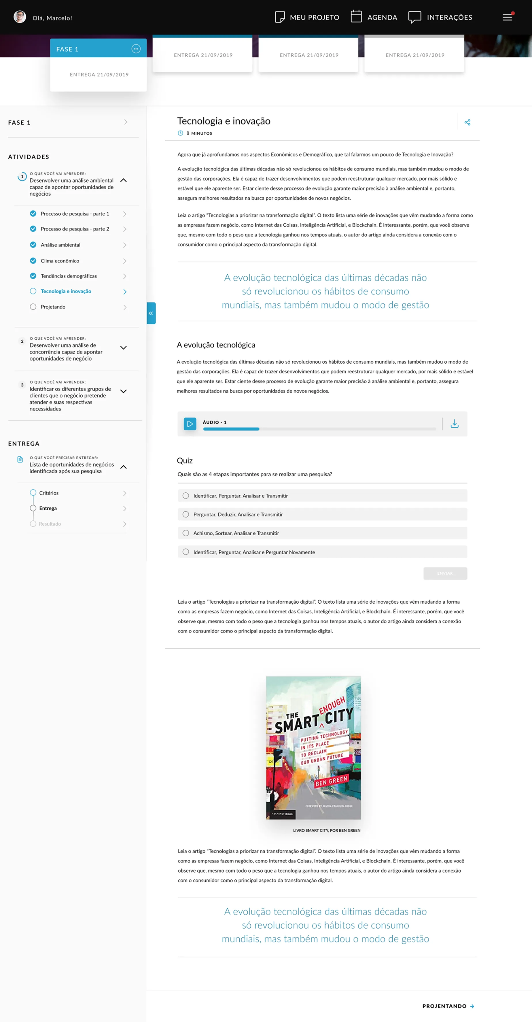
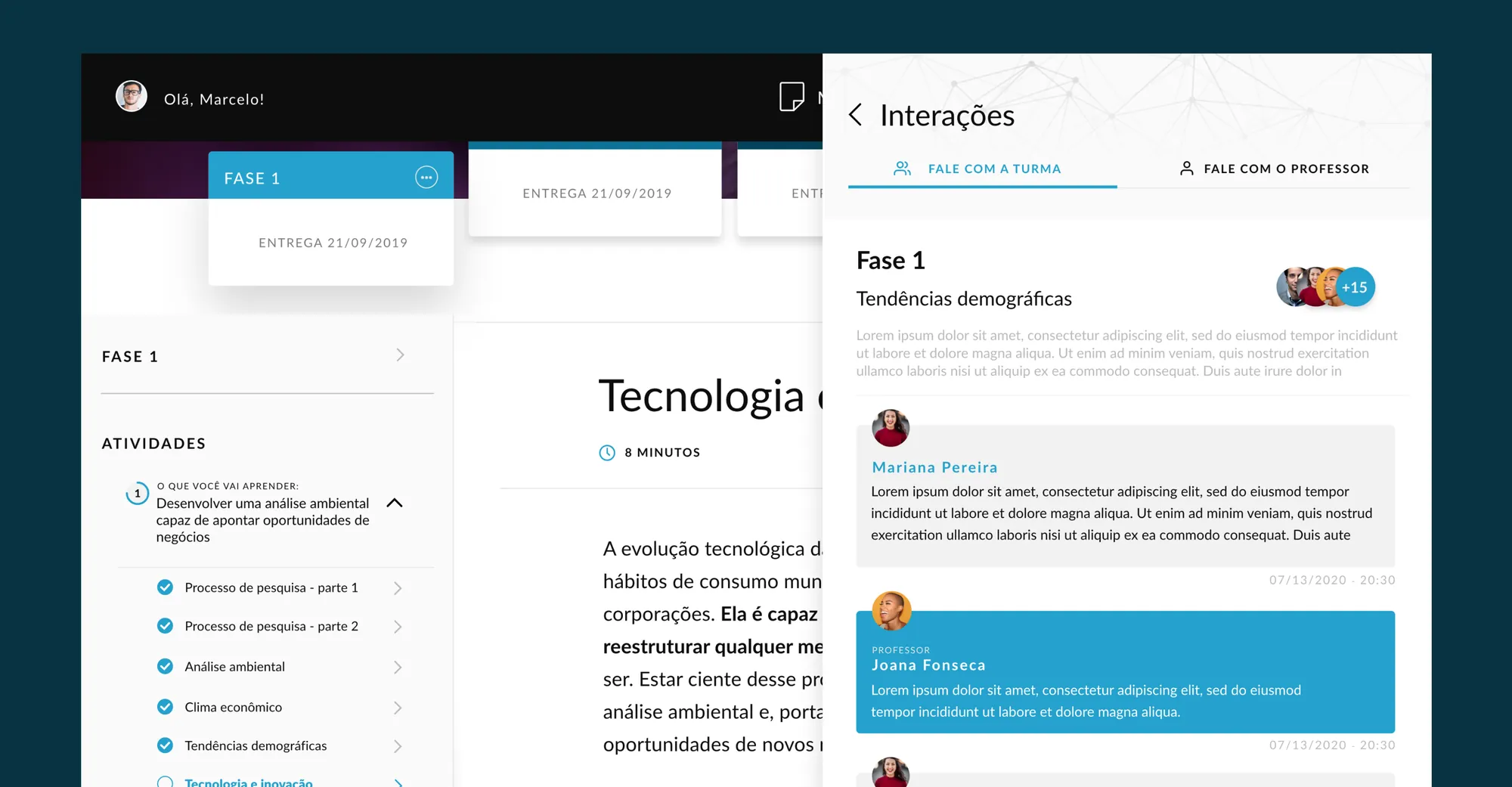
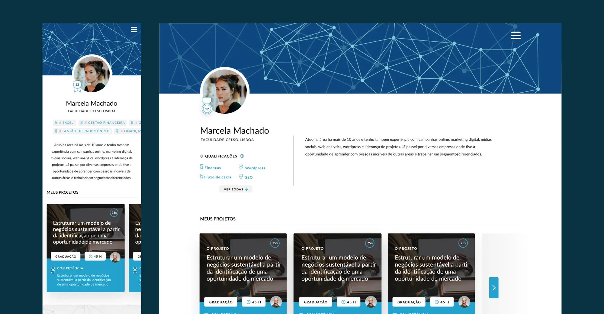
I designed the full experience: the learning flows, the evaluation patterns, and the student response UI. In practice I owned the logic of how a student moves through a course, reaches an assessment, answers it, and gets a result — the backbone of the product, not just its surface.
The decision that shaped everything
The short timeline wasn't only a constraint — it became an editing tool. There was no time to design ten flavours of assessment interaction, so I chose to design one evaluation core properly and make everything else lean on it. Clarity through scarcity: fewer patterns, each one resolved to the bottom.
Concretely, I standardised how a question is presented, how a student records and reviews an answer before committing, and how assessment state — not started, in progress, submitted, graded — stays visible at all times. A student should never have to wonder “did that save?” or “have I already submitted?” In an exam, that doubt is the most expensive failure there is.
Why it mattered
Consistency is what makes a system fast to ship and cheap to extend. Because every assessment shares one grammar, each new question type inherited already-resolved behaviour instead of reopening the debate. The deadline, which should have fragmented the product, actually forced coherence.
Result
The app shipped as Liga and today holds a 4.7 rating. It's worth being honest about the negative feedback that exists: it clusters around the institution's internal processes — academic rules, deadlines, administrative decisions — not the design of the experience. That's a distinction I won't paper over: what was mine — the clarity of the flows and the evaluation — holds up; the friction that remains lives in another layer.
TL;DR
A Rio college had to move classes, submissions and exams online in weeks. I designed the entire experience and used the tight deadline as a filter: one evaluation core resolved properly — question presentation, reviewable answers, always-visible submission state — with everything else leaning on it. It shipped as Liga at a 4.7 rating; the criticism that exists is about internal processes, not the design.
※